Image
This page describes the properties of the Image widget. You can add images using URLs or base64 strings. The Image widget supports popular formats such as JPG, PNG, SVG, WebP, and GIF.
Content propeties
These properties are customizable options present in the property pane of the widget, allowing users to modify the widget according to their preferences.
Data
Image string
Sets the source from which to render the image. Accepts an image URL, data URI, or base64 encoded image data.
Example: If you want to display inline SVG, paste your SVG content in the Image property and escape the special characters with the UTF-8 equivalents.
data:image/svg+xml,%3Csvg xmlns='http://www.w3.org/2000/svg' width='100' height='100'%3E%3Ccircle cx='50' cy='50' r='40' stroke='green' stroke-width='4' fill='yellow' /%3E%3C/svg%3E
You can also display images that dynamically change based on user input or other components, such as widgets or queries.
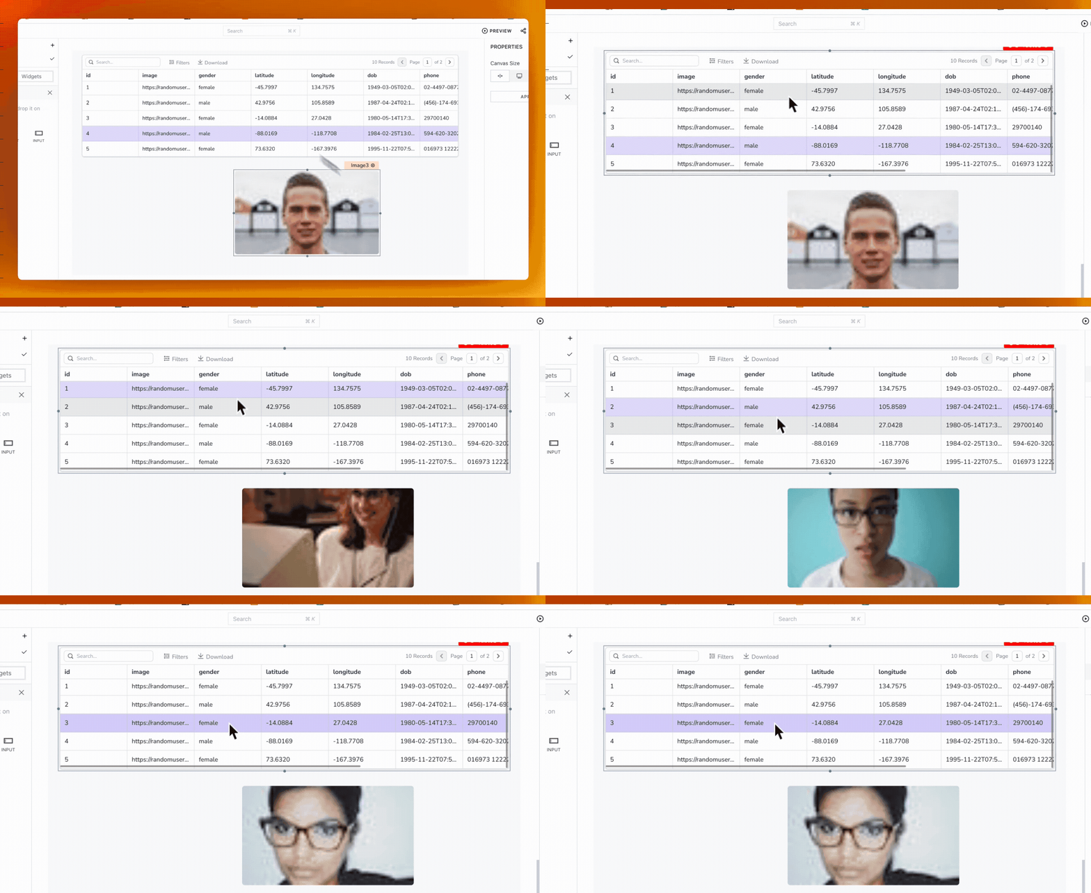
Example: Suppose you have a Table widget displaying a list of users with their respective image URLs stored in a column. To bind the images, use {{Table1.selectedRow.image}} in the Image property, where "Table1" is the name of your table widget, and "image" is the column name containing the image URL.

If you are fetching an image from the Amazon S3 bucket, add the following code in the Image property to display the image on the widget:
{{list_files.data[0].signedUrl}}
Default image string
Sets a default image that would be displayed if no image is rendered via the Image property. Accepts an image URL, data URI, or base64 encoded image data.
General
Object fit string
Sets how the image should be resized to fit its container.
Options:
- Contain: The image keeps its aspect ratio, but is resized to fit within the widget dimension.
- Cover: The image keeps its aspect ratio and fills the widget dimension, which means the image is clipped to fill the widget.
- Auto: The image retains its original dimensions.
With JS enabled, accepts string values auto, cover, or contain. See CSS object-fit for reference on these behaviors.
Max zoom level number
Sets the maximum allowable zoom level for the image view. Th available options are 2x, 4x, 8x, 16x. With JS enabled, it accepts a number as the zoom level.
Visible boolean
Controls the visibility of the widget. If you turn off this property, the widget is not visible in View mode. Additionally, you can use JavaScript by clicking on JS next to the Visible property to control the widget's visibility conditionally.
For example, if you want to make the widget visible only when the user checks an item in a Checkbox widget, you can use the following JavaScript expression in the visible property of the Image widget:
{{Checkbox1.isChecked}}
Animate Loading boolean
Controls whether the widget is displayed with a loading animation. When enabled, the widget shows a skeletal animation during the loading process. Additionally, you can control it through JavaScript by clicking on the JS next to the property.
Enable rotation boolean
Enables control over image rotation. When enabled, hover over the image and click the rotate icon.
Enable download boolean
Enables users to control whether the image is allowed to be downloaded. When enabled, hover over the image and click the download icon.
Alternatively, you can use the built-in Download function and set it to run on the onClick event of the Image widget as shown below:
{{download(Image1.image,'my-image-name','image/png')}}
Events
When the event is triggered, these event handlers can execute queries, JS code, or other supported actions.
onClick
Triggers when the user clicks on the image.
Style properties
Style properties allow you to change the look and feel of the widget.
Border and shadow
Border radius string
Applies rounded corners to the outer edge of the widget. If JavaScript is enabled, you can specify valid CSS border-radius to adjust the radius of the corners.
Box Shadow string
This property adds a drop shadow effect to the frame of the widget. If JavaScript is enabled, you can specify valid CSS box-shadow values to customize the appearance of the shadow.
Reference properties
Reference properties enable you to access the widget's data and state using the dot operator in other widgets or JavaScript functions. They provide additional information or allow interaction with the widget programmatically. For instance, to retrieve the visibility status of an Image widget, you can use Image1.isVisible.
image string
Contains the URL of the image source.
Example:
{{Image1.image}}
isVisible boolean
The isVisible property indicates the visibility state of a widget, with true indicating it is visible and false indicating it is hidden.
Example:
{{Image1.isVisible}}
Methods
Widget property setters enable you to modify the values of widget properties at runtime, eliminating the need to manually update properties in the editor.
These methods are asynchronous and return a Promise. You can use the .then() block to ensure the execution and sequencing of subsequent lines of code in Appsmith.
setVisibility (param: boolean): Promise
Sets the visibility of the widget.
Example:
Image1.setVisibility(true)
setImage (param: string): Promise
Sets the base64 encoded image in the Image widget.
Example:
Image1.setImage('data:image/png;base64,iVBORw0KG...')